BRANDING / COMMUNICATION / CREATIVE DIRECTION / AI / WEB DESIGN
FOLLAGH STUDIO
An author-led identity, from brand direction to digital presence.
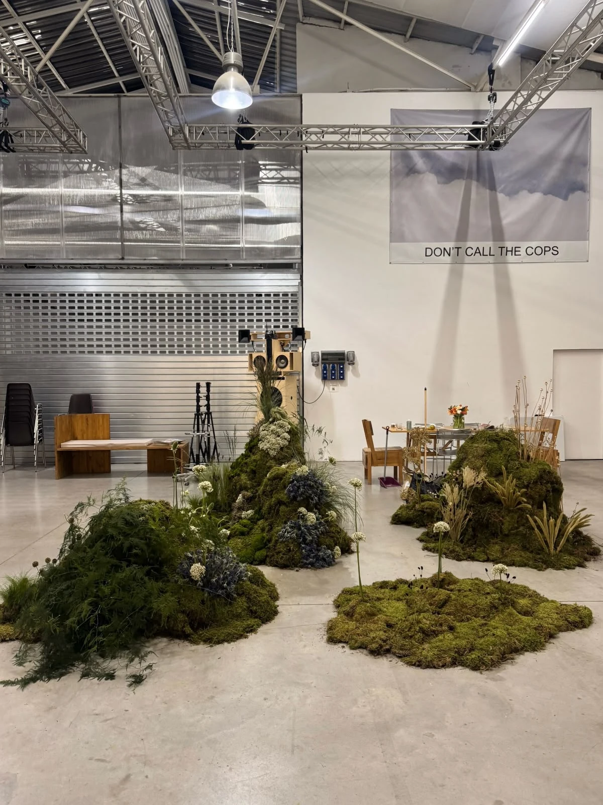
Floral design: Follagh Studio. Brand direction and digital experience: SUBSENSE.
01 / THE CHALLENGE
A distinct perspective. A space of its own.
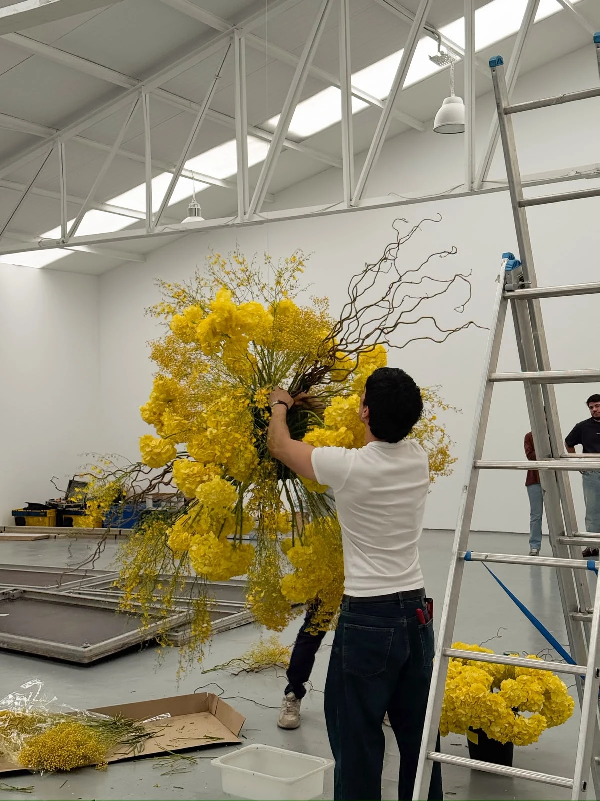
Build a professional presence beyond Instagram. Present Gianfranco’s work as artistic floral design and clearly explain his projects for brands, weddings and private events.
02 / BRAND DIRECTION
Authorship before decoration.
The brand places Follagh between art, fashion, design and architecture. Image selection, space and compositional tension express an artistic, selective and human personality.
03 / VISUAL IDENTITY
A system that makes room to look.
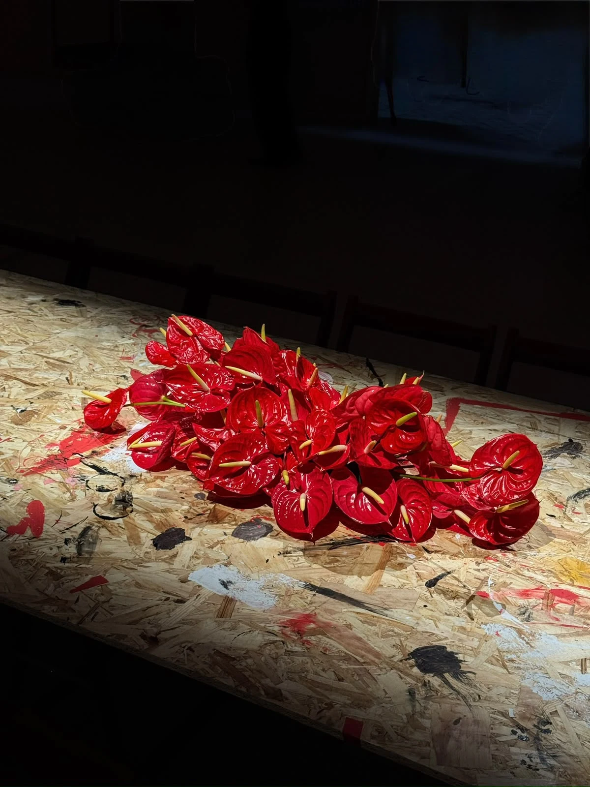
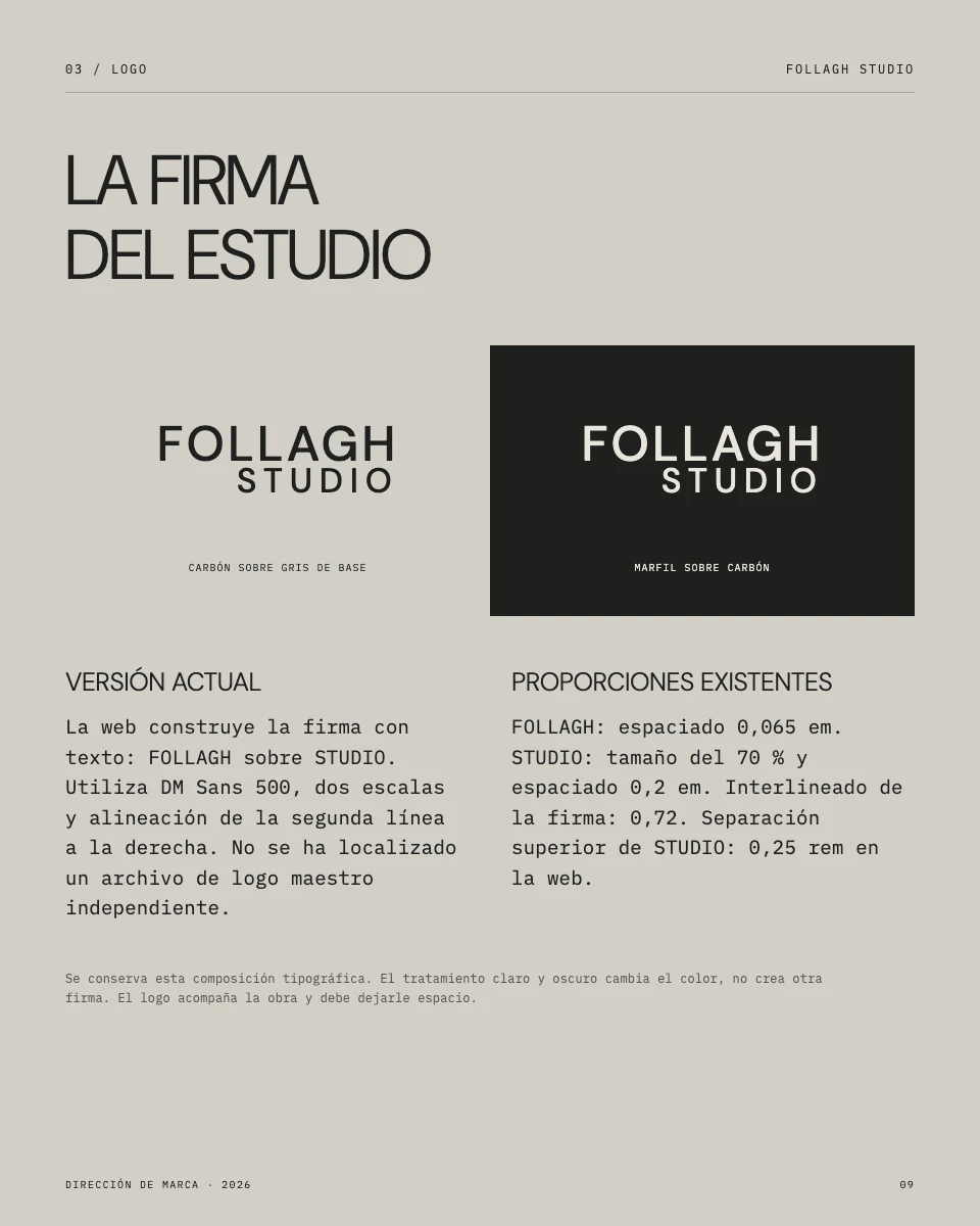
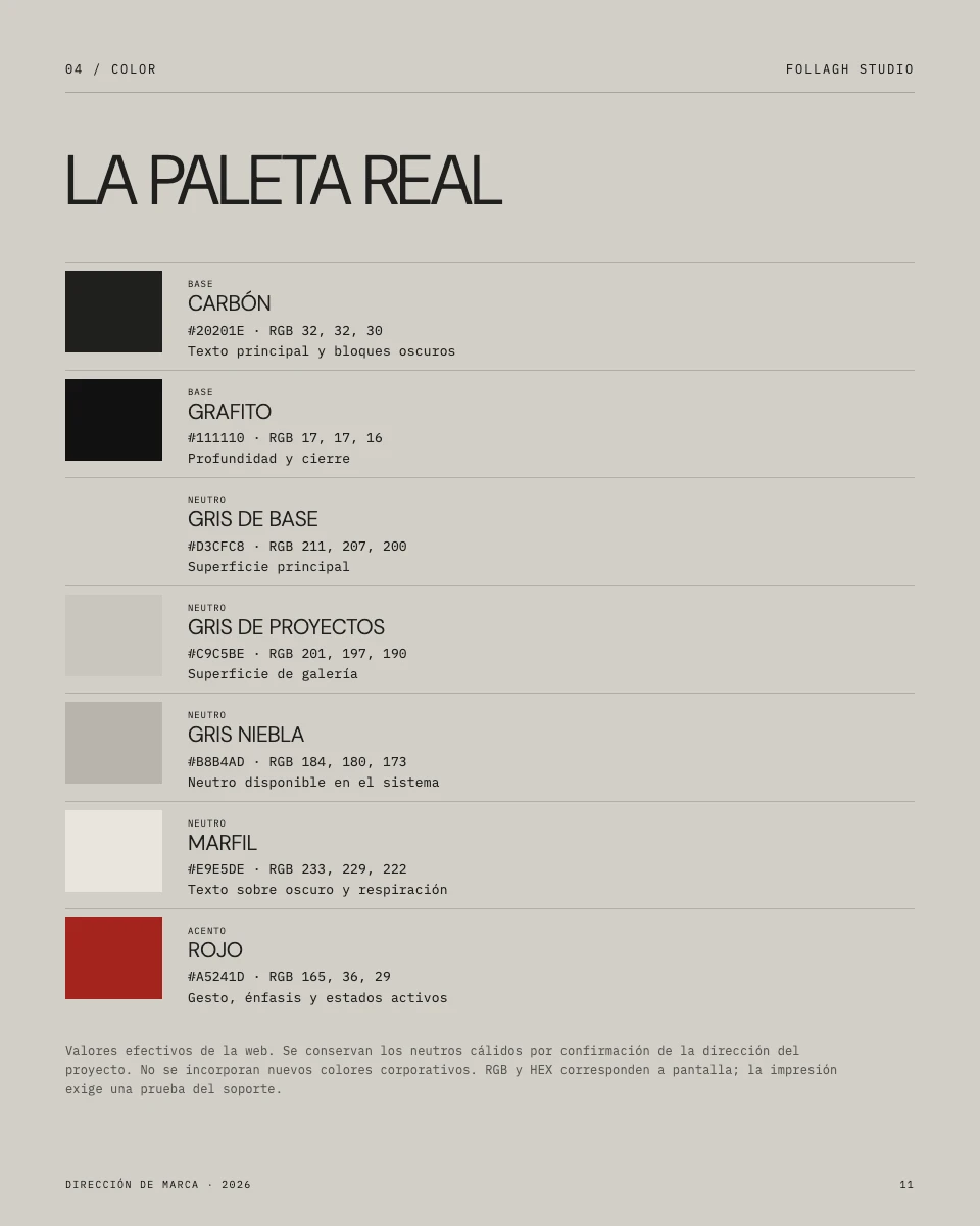
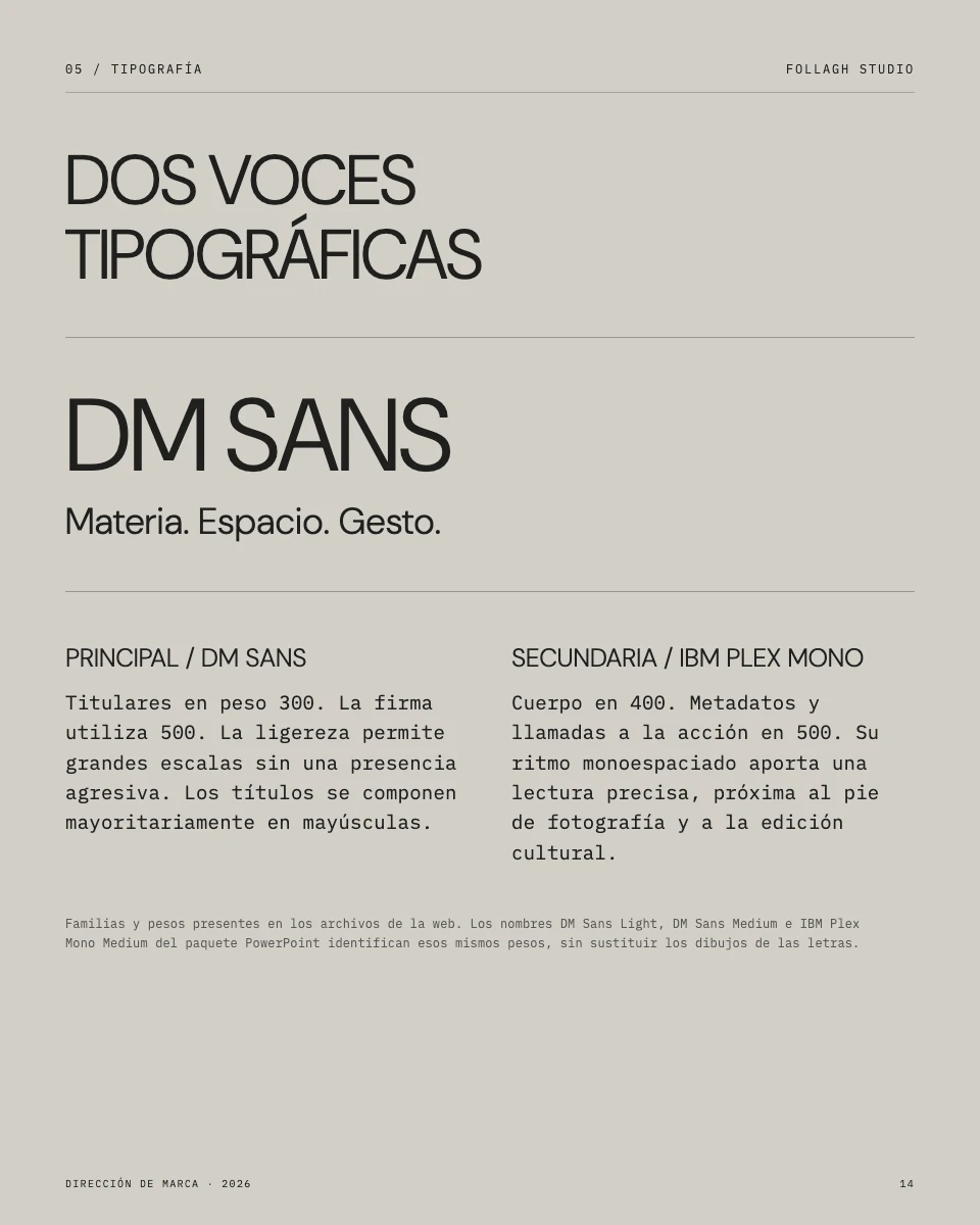
The typographic signature, warm neutrals and red accent create continuity. DM Sans gives headlines lightness; IBM Plex Mono brings precision to text and metadata. The manual records the existing identity and proposes rules for applying it to other formats.
04 / COMMUNICATION
Artistic language. Clear information.
The voice speaks of material, scale and place, while making the studio’s work clear. Services use brief, concrete copy; the first person conveys Gianfranco’s perspective.
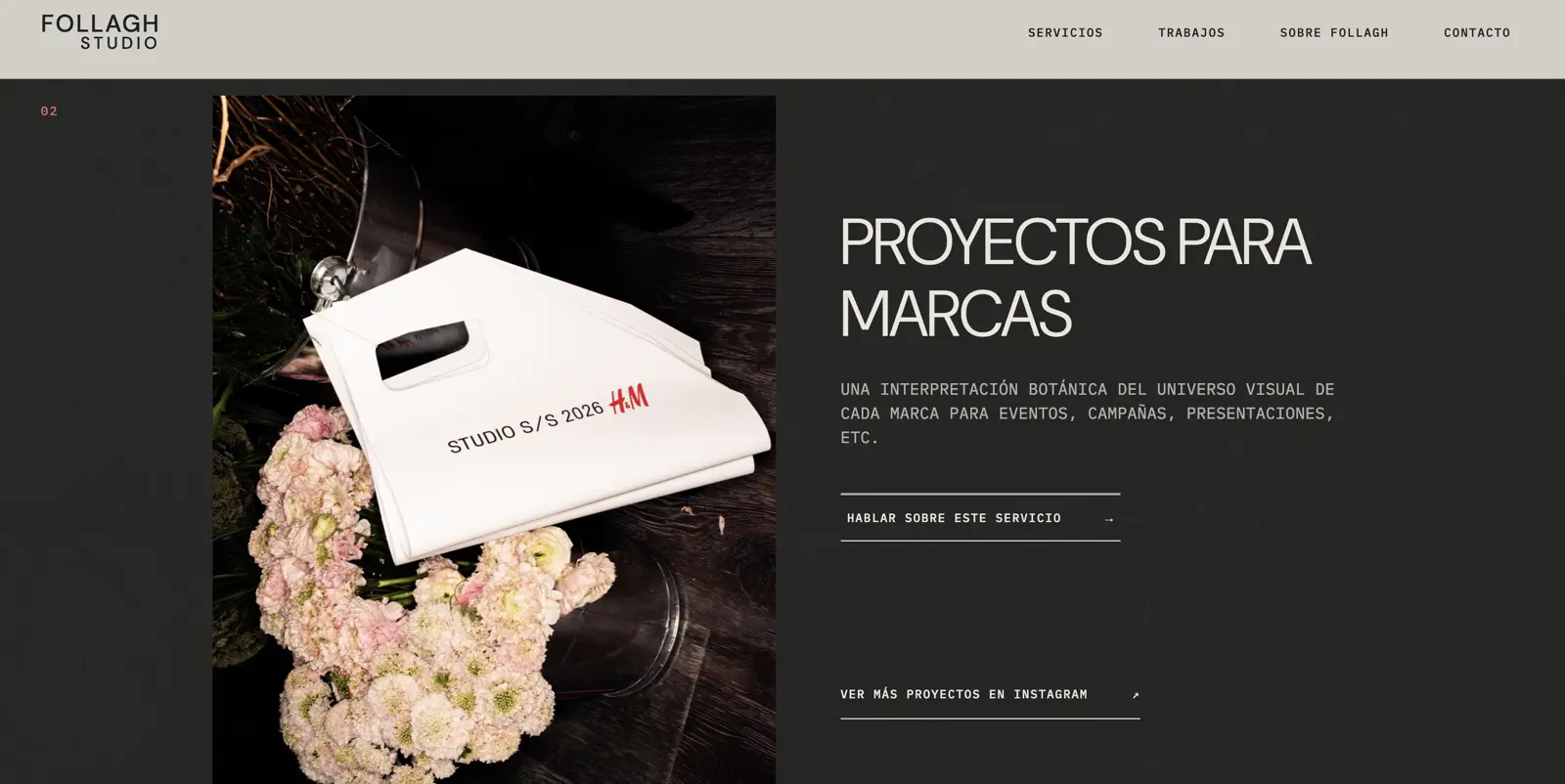
“A botanical interpretation of each brand’s visual universe for events, campaigns, presentations and more.”Website copy / Brand projects
05 / DIGITAL EXPERIENCE
The website extends the identity.
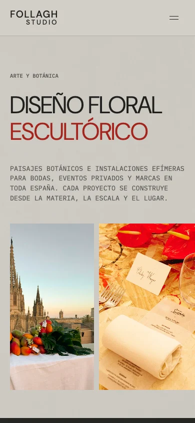
Projects, services and authorship share one editorial direction. Images vary in scale and framing; navigation leads to the work and contact. On mobile, featured work uses a carousel and a dedicated composition.
06 / AI AND WORKING PROCESS
Tools guided by judgement.
AI was integrated into production and development through instructions, review and iterations. Brand direction, material selection and content decisions guided the process. The tool supports the execution of a creative intention.
07 / USABILITY AND DEVELOPMENT
Designed to view and explore.
The implementation adapts compositions to different widths, serves local fonts and defines image dimensions. The mobile menu, focus states, skip link and validated form bring visual direction into everyday use.
08 / SEO AND STRUCTURE
An editorial foundation in the code.
The home page includes a descriptive title, meta description and Open Graph title and description. Sections and headings organise the content, and photographs include alternative text. An on-page foundation that explains the studio beyond its visual composition.
09 / BRAND MANUAL
Coherence continues beyond the website.
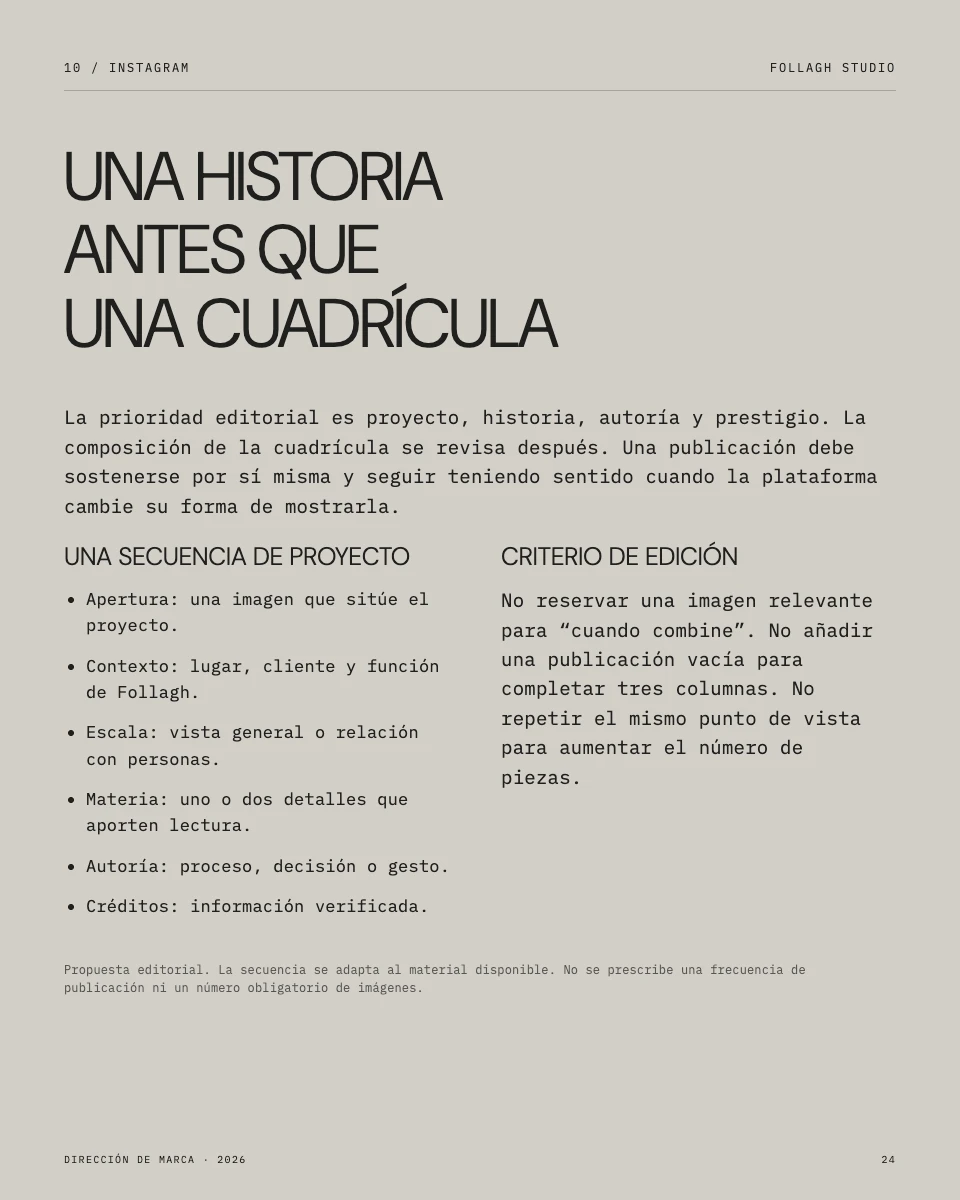
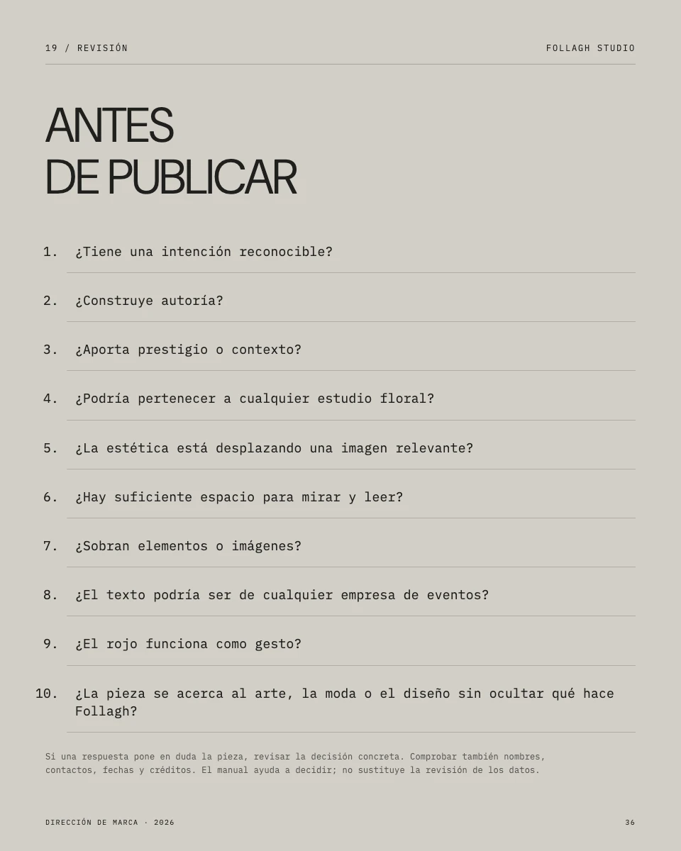
The 42-page manual brings together visual identity, voice and editorial criteria. Its Instagram proposals and editable presentation templates extend the system to new pieces with a shared perspective.
10 / THE RESULT
An identity ready to evolve.
A digital presence and a brand system that share authorship, sensitivity and clarity. The website presents the work; the manual preserves the direction in presentations and future communication pieces.